• Editor
  • Minimize waste of space after names in Dopesheet and Graph editor

  • تم التحرير

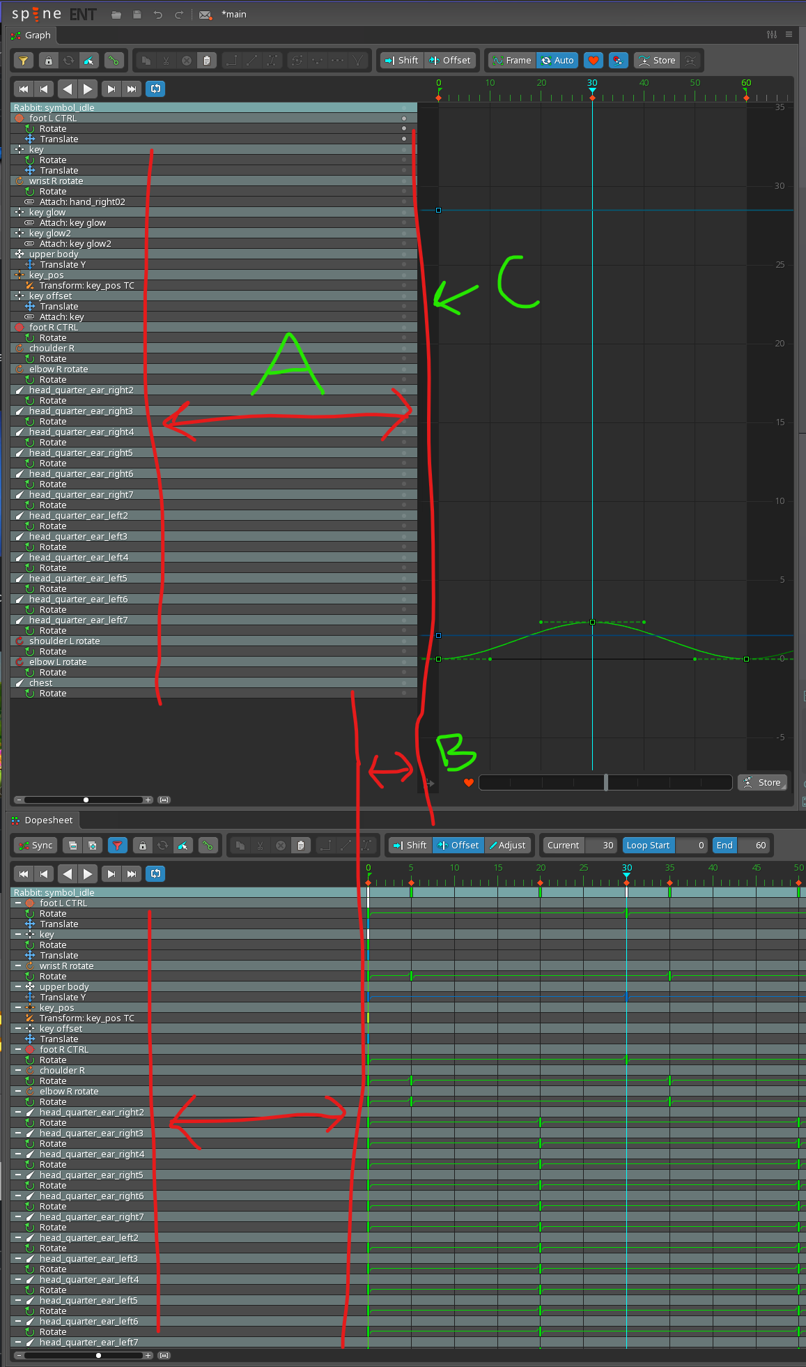
Hi, could we get some user control to minimize the wasted space (A)

And why isn't (B) the same size as (A)

It would be really great if we could drag the regions right edge (C) close to the names. Currently it's difficult to work with both graphs and dopesheet open at the same time as their work area gets so compressed when you want to leave space over for the other view ports.

Related Discussions
...

The width of the dopesheet and graph names is managed automatically. It increases as needed, but it doesn't not decrease automatically as you change selections because that would cause timeline position to change, making your keys jump around. That is jarring and makes working with the graph/dopesheet more difficult.

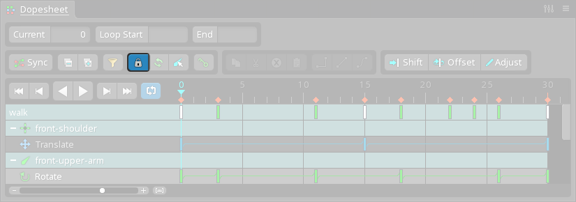
Clicking the lock icon adjusts the width to the current items. When locked the width never changes and is only as wide as necessary.

You must have some very long names to get it so wide? To reset the width, you can click the lock icon twice, to lock and unlock.

Dragging to control the width adds a tedious action that would be better to handle automatically. If the above doesn't solve your annoyance, maybe we could allow reducing the width down to a size that fits a majority of names. That way having one long name doesn't result in a high width that requires manually reducing.
    Nate Sorry what lock icon?

    • تم التحرير

    I think it's the icon next to the filter icon.

    Image removed due to the lack of support for HTTPS. | Show Anyway

    Nate I actually was not. I thought you said double clicking so I excluded that button since double click was not option there 😃

    Ah, it's not really a double click action, just clicking twice. The first click turns it on, the second click turns it off.